Visualizing Dual Reporting Structures with OrgChart JS
Visualizing Dual Reporting Structures with OrgChart JS
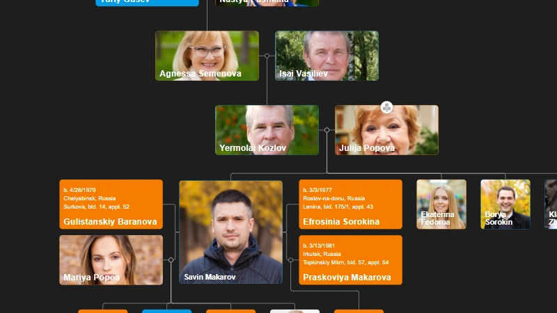
Organizational charts are a powerful tool for visualizing company hierarchy. Sometimes, however, employees have dual reporting relationships, which can be tricky to represent in a standard org chart. This blog post demonstrates how to use the OrgChart JS library to effectively visualize such scenarios, using dotted lines to indicate secondary reporting structures. We'll walk through a code example where Anahi Gordon, the QA Manager, reports to both the IT Director and the CEO.
Setting up the Dotted Line Template
The key to visualizing dual reporting lies in customizing the link between nodes. OrgChart allows you to define custom templates for different types of connections. Here's the code snippet that creates a "dotted" template:
OrgChart.templates.dotted = Object.assign({}, OrgChart.templates.olivia);
OrgChart.templates.dotted.label =
    `<text ${OrgChart.attr.width}="135" class="olivia-f0" x="90" y="-35">{val}</text>`;

OrgChart.templates.dotted.defs =
    `<marker id="arrowdown" viewBox="0 0 10 10" refX="8" refY="5" markerWidth="12" markerHeight="12" orient="auto-start-reverse">
        <path fill="#F57C00" d="M 0 0 L 10 5 L 0 10 z" />
    </marker>
    <marker id="arrowup" viewBox="0 0 10 10" refX="8" refY="5" markerWidth="12" markerHeight="12" orient="auto-start-reverse">
        <path fill="#F57C00" d="M 0 0 L 10 5 L 0 10 z" />
    </marker>`;
OrgChart.templates.dotted.link =
    `<path marker-start="url(#arrowup)" marker-end="url(#arrowdown)" stroke-linejoin="round" stroke="#aeaeae" stroke-width="1px" fill="none" d="M{xa},{ya} {xb},{yb} {xc},{yc} L{xd},{yd}" />`;
This code snippet first creates a new template called dotted by copying the existing olivia template. Then, it customizes the label, defs, and link properties. The defs section defines the arrow markers used at the start and end of the dotted line. The link property defines the path of the dotted line itself, including the arrow markers. The stroke property controls the color of the line, and stroke-width controls the thickness.
Creating the Organization Chart and Defining Dotted Lines
var chart = new OrgChart(document.getElementById("tree"), {
    template: "olivia",
    mouseScrool: OrgChart.action.ctrlZoom,
    enableSearch: false,
    dottedLines: [
        { from: 5, to: 1, tags: ["dotted"] },
    ],
    tags: {
        "dotted": {
            template: "dotted"
        }
    },
    nodeBinding: {
        field_0: "name",
        field_1: "title",
        img_0: "img",
        label: "label"
    },
});
Here, dottedLines is an array of objects. Each object defines a dotted line. from and to specify the IDs of the nodes connected by the dotted line. tags is used to associate the dotted line with the custom template we created earlier. The tags object then links the "dotted" tag to the dotted template.
Loading the Data
Finally, we load the employee data:
chart.load([
    { id: 1, name: "Jack Hill", title: "CEO", email: "amber@domain.com", img: "https://cdn.balkan.app/shared/a/1.jpg" },
    { id: 2, pid: 1, name: "Lexie Cole", title: "Sales Director", email: "ava@domain.com", img: "https://cdn.balkan.app/shared/a/2.jpg" },
    { id: 3, pid: 1, name: "Aaliyah Webb", title: "IT Director", email: "jay@domain.com", img: "https://cdn.balkan.app/shared/a/4.jpg" },
    { id: 4, pid: 3, name: "Elliot Ross", title: "Dev Team Lead", img: "https://cdn.balkan.app/shared/a/5.jpg" },
    { id: 5, pid: 3, name: "Anahi Gordon", title: "QA Manager", label: "my label", img: "https://cdn.balkan.app/shared/a/6.jpg" }
]);
Notice that Anahi Gordon (id: 5) reports to the IT Director (id: 3) through the standard hierarchical structure defined by the pid (parent ID) property. The dottedLines array then establishes a secondary reporting relationship to the CEO (id: 1).
By using this approach, you can clearly visualize complex reporting structures in your organizational charts, making them more informative and easier to understand. This is especially useful for representing matrix management or other scenarios where individuals have multiple reporting lines. Remember to include the OrgChart library in your project for this code to work.
Improved Slink Positioning in OrgChart JS
Show initials in OrgChart JS

Implementing Custom Auth for Server JS
OrgChart JS Controls

File-Like Structure with OrgChart JS
Update Alert: New twix template and cleaner connections

OrgChart JS Mobile Support Is Live
OrgChart JS Mobile View
OrgChart JS: Always First, Always Innovating

Introducing Tree List: A New Way to Visualize Hierarchies in 2026
How to Create a Custom CSS Tooltip on Node Hover in OrgChart JS
Build and Share Org Charts Easily — Meet the Free OrgChart App by BALKAN App
Meet OrgChart App - Your New Way to Build and Share Org Charts

OrgChart PDF Cover Page

Minimize and Maximize nodes in OrgChart JS

Copy an OrgChart to Clipboard

Copy OrgChart Data to Clipboard

Pan on Node Is Now the Default in OrgChart JS

Export 2 Charts in a Single PDF

Introducing Liquid Glass Buttons in OrgChart JS

OrgScribe: The Markdown-Style Way to Build Org Charts

Achieve Any OrgChart Design

Why Not Load on Demand in OrgChart JS
JSON Export Slinks with Nodes in OrgChart JS

OrgChart JS Privacy

GEDCOM in Family Tree JS 2

Update a JSON File with Family Tree Members

Hide Nodes in an OrgChart with CSS

Pin (set as root) a node in an OrgChart

WordPress OrgChart Plugin

Family Tree in WordPress

Organizational Charts with Multiple Parents

Introducing new PDF and PNG Previews in OrgChart JS

Building an Org Chart MVP

Introducing PowerPoint Preview in OrgChart JS
Change The Order in the OrgChart by Drag and Drop (Simple Example)

Highlight to the root on search in OrgChart JS

OrgChart JS Now Supports Export to PowerPoint
OrgChart JS Now Supports Export to PowerPoint

Dynamically changing an orgchart field

Project Timeline Chart

OrgChart Conditional Node Size

Add CSS on Export in OrgChart JS

OrgChart JS Angular Templates

Org Chart Web App with Node.js and Express

Loading on Demand with Family Tree JS 2

Dynamic Colors Organizational Chart

Charlie Chaplin Family Tree

Introducing Family Tree JS 2: The Next Generation is Here!

React OrgChart

Create and run an OrgChart Single Page Application with Node.js – beginner's guide.

Export and Import Org Chart to Excel

Adding Custom HTML Elements into OrgChart JS container

Еasily Create a Template in an OrgChart

Node Swapping in an Organizational Chart

Vladimir Putin Family Tree

Add Field Data in Expand button with OrgChart JS

Bill Gates Family Tree

Create a Tooltip for a ForeignObject Element Hover in OrgChart JS

Custom Aligning Nodes in a JavaScript Organizational Chart

Center and Zoom on Search Click in OrgChart JS

Create Multiline Group Titles in OrgChart JS

Adding Arrows in OrgChart JS Links

Show a Custom Edit Form for a node in OrgChart JS

Jeff Bezos Family Tree

How to Add Material Icons in OrgChart JS

Leonardo DiCaprio Family Tree

Exporting OrgChart JS to A4 PDF: A Step-by-Step Guide

Genghis Khan Family Tree: The Lineage of the Great Khan

OrgChart JS now support Export to Visio

New Export Option: childLevels in OrgChart JS

Elon Musk Family Tree

AI for OrgChart JS: Revolutionizing Organization Charts

Family Tree JS 2 (Preview)

d3 org chart

Our Family Tree App is Now on Android!

Why BALKAN OrgChart JS is the Best Organizational Chart Library

How to Create a JavaScript Flow Chart

How to Add an Organizational Chart to a Mobile Application

How to Create a JavaScript Organizational Chart

OrgChart JS Now Supports PDF Export Per Team

Introducing Family Tree App

Donald Trump Family Tree

Discover Your Roots: Build Your Family Tree with BALKAN App

JavaScript Organization Chart

Instantly create interactive, intuitive flowcharts in seconds

JavaScript Hierarchy Chart

Mermaid js alternative

Create Flowcharts in Seconds with Flow Chart JS: Your New Favorite JavaScript Library

Customizing Filter UI - Code of The Week

Zoom Slider - Code of The Week

Bookmarks - Code of The Week

Customizing Search Results - Code of The Week

Introducing Undo Redo - Code Of The Week

Price adjustment announcement

The price will increase for new customers

Buttons for adding family members to a family tree - Code of The Week

Levels - Code of The Week

Change node color from a button in the Edit Form - Code of The Week

Filter and Highlight Nodes - Code of The Week

Up Expanding - Code Of The Week

Programmatically move the chart - Code of The Week

Siblings in Family Tree JS - Code of The Week

Purple template - Code of The Week

Assistant With Children - Code of The Week

Conditional Layout - Code of The Week

Conditional Color - Code of the Week

Sriniz Family Tree Template - Code of The Week

Color Picker - Code of The Week

Add company logo as watermark in exported PDF documents - Code of The Week

Mind map - Code of The Week

Create relationship with circle menu - Code of The Week

Animated Photos - Code of the Week

Grouped Dotted Lines - Code Of The Week

Dotted Lines - Code Of The Week

Department Dynamic Title - Code Of The Week

Add expand button for partners - Code of the Week

Change the sub levels with Drag and Drop - Code of The Week

Custom Edit From using Popover - Code of the Week

Sub levels tag option - Code of the Week

Highlights search results directly on Org Chart nodes - Code of the Week

Code of the Week/Relationship maps and Business process diagrams

Search using field name abbreviations - Code of the Week

Dynamic Template - Code of the Week

Read and Write local CSV file using File API and Org Chart JS - Code of The Week

Organizational Chart Path Highlighting and Selection

Modern Template - Org Chart JS

Performance - Org Chart JS
Single parent is supported in Family Tree JS
How To Develop a Flowchart Maker with Org Chart JS
How to upload a photo to Family Tree JS in .NET core
How to change the color of selected node - Family Tree JS
